
Creating Two Brands
|
Tools
Photoshop Illustrator InDesign |

Roles
Visual Design Writer Research |
Team
Celine Edouard (myself) |
Duration
January 2021 - March 2021 (3 months) |
|
Overview
For my Visual Design II class, we had a semester long assignment of creating lockups for two distinct brands based on designing principles we learned in class. A lockup is the final form of a logo that includes icon, logotype, and a tagline. My two brands were a children’s clothing company and a gaming company. After creating my lockups, I created a style guide for each brand to explain my design decisions and the design principles I applied. |
Goals
|
|
Process
We started the process by choosing two opposing brands. One brand would utilize high key colors and the other would utilize low key colors. The purpose was to depict two brands that had opposing images. Based on the images we wanted to create, we chose two keywords each to depict our brands. We then chose our color pallets for each brand and began working on our logos. We constantly received feedback in order to make changes to our final lockup. Our next step was creating style guides to explain our decision decisions. Our style guide was categorized into four main sections: Brand Image/Impression, Color Schemes, Typography, and Lines & Shapes.
|
Brand Impressions
|
For my children’s clothing brand, I wanted to represent a playful, girly nature. I wanted to make sure my logo was child-like so kids could resonate with it when they see it.
|
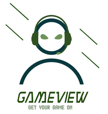
As for my gaming company, I wanted to give off a modern, edgy feel. I wanted users to immediately be able to tell what kind of company we are by simply looking at the logo. The following information explains the design decisions I made in order to achieve these brand goals.
|
|
|
|
Color Schemes

|
|
|
MyLittle Closet
MyLittleCloset’s brand colors are high-key to demonstrate our playful and girly image. MyLittleCloset has a split complementary color scheme: high-keyed purple, yellow-orange, and yellow-green. Split-complementary offers a pleasant contrast and can be executed without being too loud/over-the-top. Split complementary color schemes can be used in a variety of ways. One way is used to decorate child-related environments.It is also commonly used for floral arrangments - and MyLittleCloset satisfies both methods. |
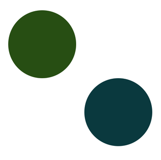
GameView
GameView’s brand colors are low-key to further demonstrate our modern, edgy image. GameView has an analogous color scheme: low-keyed green and blue-green. In design, analogous color schemes are used to portray a modern, unified flow. |
Typography
|
|
|
MyLittleCloset
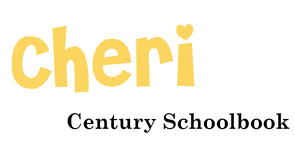
MyLittleCloset’s brand typeface is called Cheri. The font resembles youthful handwriting, making it child-like. The typeface accurately represents the brand’s playfulness and friendliness. The typeface also dramatizes curved lines, which emphasizes comfort and ease - making our brand welcoming to children and families. Our tagline text is Century Schoolbook - another typeface that channels kids. This further supports our brand’s playful, youthful image. |
GameView
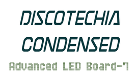
GameView’s brand typeface is Discotechica Condensed. It resembles a popular font used in video games. This typeface accurately represents our brand’s modernity and demonstrates what the brand’s content: videogames. It also places an emphasis on straight lines. The “Condensed” aspect of the typeface italicizes the text. This adds more diagonal lines to the lockup which further supports the brand’s modern, edgy image. Our tagline text is Advanced LED Board-7. This text resembles typefaces that are commonly used in digital media. This follows the theme of our video game company as well as our modern and edgy brand image |
Lines & Shapes

MyLittleCloset
I incorporated curved lines into MyLittleCloset’s logo to show a welcoming, comfortable feeling - something kids can respond to. I emphasized curves in the final lockup even more by making the child’s outfit curve as if it is in the wind - this is meant to resemble an outfit swinging on a clothes rack. |

GameView
I incorporated diagonal lines into the lockup for my gaming brand because diagonal lines represent movement and action - which support our brand’s fast paced environment and the intense nature of video games. The diagonal lines also supports the brand’s modern, edgy image. |
Style Guides
|
Once I made the final changes to my lockups, I created style guides for each to explain, in detail, the design decision I made. You can click the buttons below to access my style guides.
|
Conclusion
|
This assignment allowed me to think deeper into my design decisions and take a more in depth look at the options available to achieve a certain brand image. Through my own research and what I learned in class, I developed a better understanding of the different factors that aid in creating specific brand images. If I were to go through the process of this project again, I would experiment with more logo ideas and push myself to try different versions of my lockups.
|