
|
Tools
Miro
Zoom Figma Discord Microsoft Teams |

Role
UI Design
Prototyping UX Research Interview Facilitator & Moderator |
Duration
January 2021 - May 2021 (4 months)
|
Overview
|
The goal of our project was to recreate an experience that has been taken away because of COVID-19. My group's focus was recreating seeing a band/artist live. We went through a Sprint to complete our project. A Sprint is normally a five day process where designers pinpoint very specific user goals to focus on when working on a prototype. We stretched the usual five day process to last the entire semester. I will explain the steps my group and I took to achieve creating our prototype while highlighting my specific contributions.
|
Meet the Team!
Celine
|

|

|
Stephanie Epeagba

|

|
Rosemary Geller

|

|
Steven Chisholm

|

|
Introduction |
|
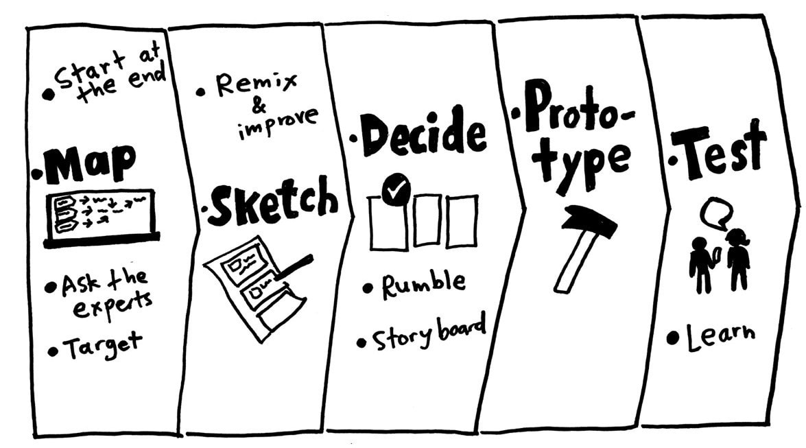
In a typical Sprint, the design team goes through their design process in five days - Monday through Friday. Monday is where we diagram our problem, interview teammates and other experts, and choose a target for our sprint. Tuesday we look for ideas & inspirations and sketch. Wednesday we decide on the best solutions and make a plan for our prototype. Thursday is where we decide what tools will be used to build our prototype and start executing our building plan. Friday is where we test our prototype and find patterns from our results. I will break down each "day" we went through and detail our design process.
|
Solution Showcase
|
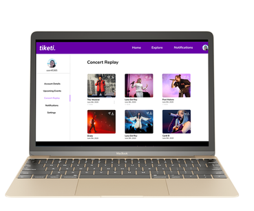
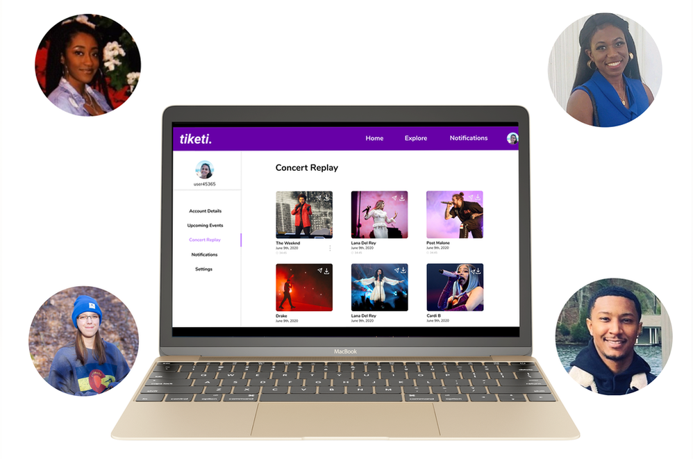
Before diving into our design process, the final solution to our project was creating a sing-along feature within a virtual concert to recreate the artist/fan interaction that comes with a live concert. Our final solution took the form of a website prototype we created using a prototyping tool called Figma.
|
|
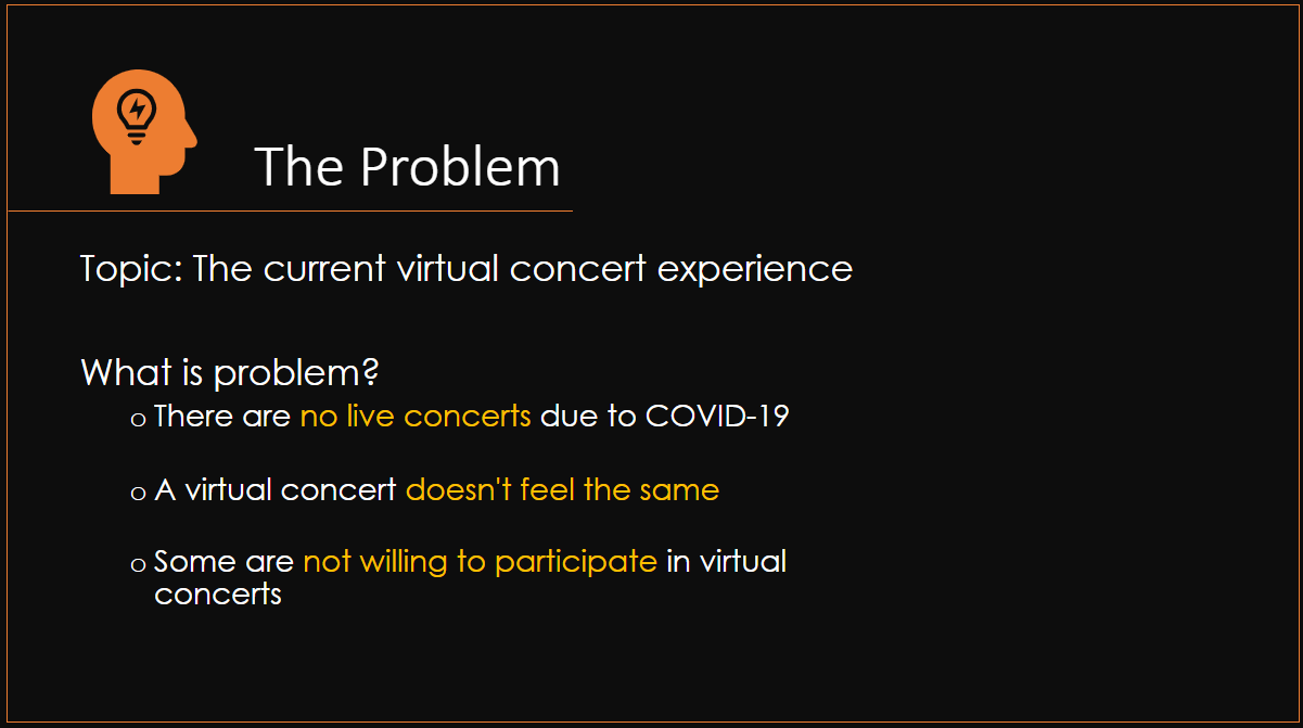
User Research
|
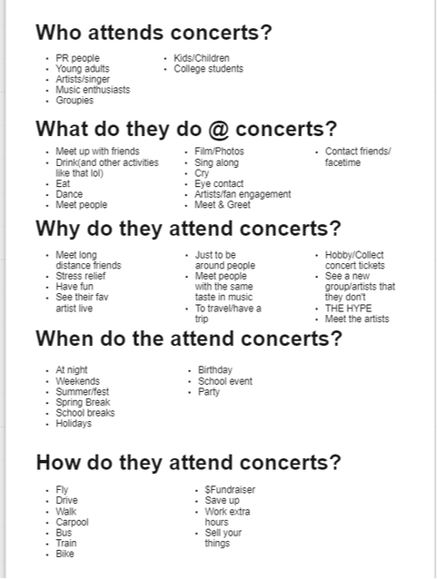
Due to COVID-19, we held all of our interviews either on Microsoft Teams, Discord, or Zoom. After each interview, we met up as a team on Discord to discuss our notes. We documented our findings using sticky notes on Miro and completed an affinity map. An affinity map is a process where each team member uses sticky notes to document their information and places them on a board, in this case our Miro board. The goal was to openly lay out all the information each of us gathered from user interviews. Once we completed our stickies, we organized them based on similarities and evaluated where there was overlap. This process helped us to see patterns among user interviews and consequently helped us determine which aspects of seeing a band live we needed to target when moving forward with our prototype.
|
Map of the Problem
|
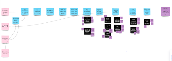
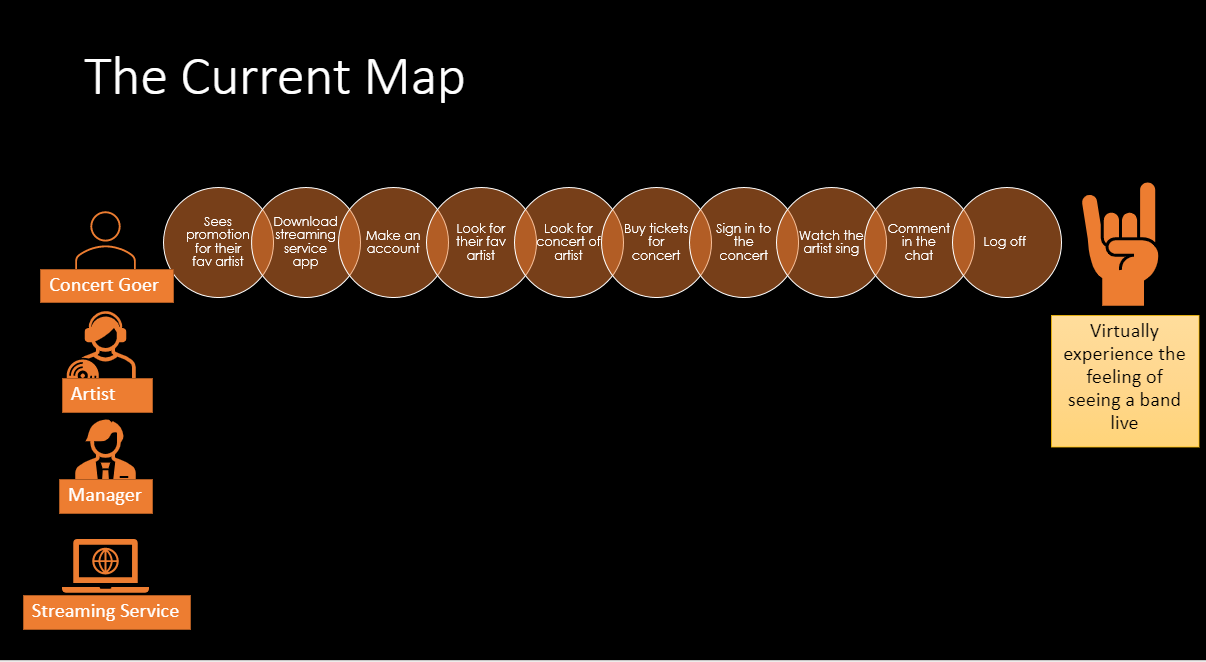
Before we began researching our problem space, we made assumptions. Then, each team member wrote five questions that would be the foundation for our research. We conducted some light research on virtual concerts so we could have some background information on our platform. On "Monday" we created a map of our problem space. This map's purpose is to represent the complexity of our problem space in a simple diagram. It also shows customers moving through our product/service. Our map serves to narrow our broad challenge into something specific for us to focus on for our Sprint.
|
|
|
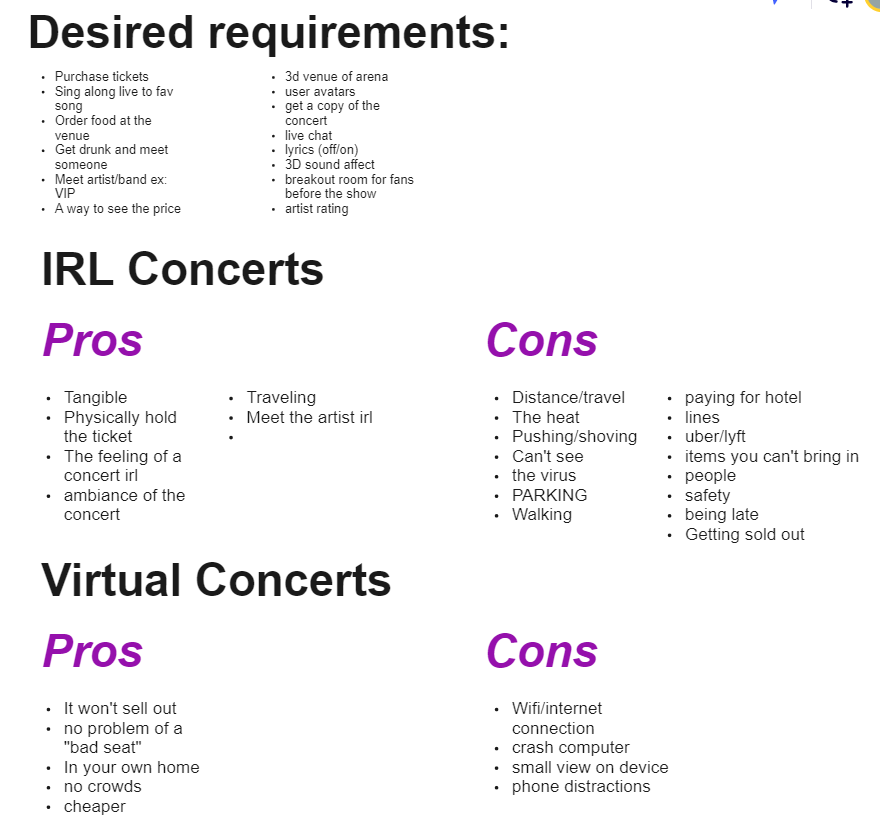
When creating the rough draft of our map, we also highlighted pain points. These pain points are existing problems that users are currently experiencing. In our case with virtual concerts, we discovered users were experiencing the following problems:
|
Prioritization
|
Our next Monday activity was called a "How Might We" exercise. For this exercise, we wrote our own notes in the question form of "How Might We" on sticky notes and posted them on our Miro board. The goal was to write down as many of our ideas as possible, then organize them and decide which ones are the most important to our target. This exercise helped us pinpoint which area of our map we wanted to focus on and will be the basis of Tuesday's sketches. Once we all wrote down our How Might We stickies, we organized them on a vertical axis according to what we believed were high/low user needs. During this organization process, we weeded out which stickies belonged on the axis and what stickies were not necessary to focus on.
|
View How Might We Activity here:
|
How Might We Rankings:
|
High User Need
|
|
Once we organized our stickies on a high user need/low user need axis, we moved onto a 2 x 2 matrix ranking system. This system is on an x and y-axis. The y-axis remained high/low user need and the x-axis represented high/low effort to achieve the How Might We. As team, we went through each How Might We sticky and evaluated how feasible it would be to achieve each sticky based on the rest of the time we had left in the semester. Once we placed our stickies on the 2 x 2 matrix, we did a dot vote. Dot voting is where we each have dot stickies and place our initials on them to vote on which sticky we think we should be the target of our sprint. Stephanie, Steven, and myself voted on, "How Might We have the artist interact with the fans?" We decided this would be our Sprint target because it was a high user need while being highly feasible to accomplish.
|
Design Critique/Art Museum
|
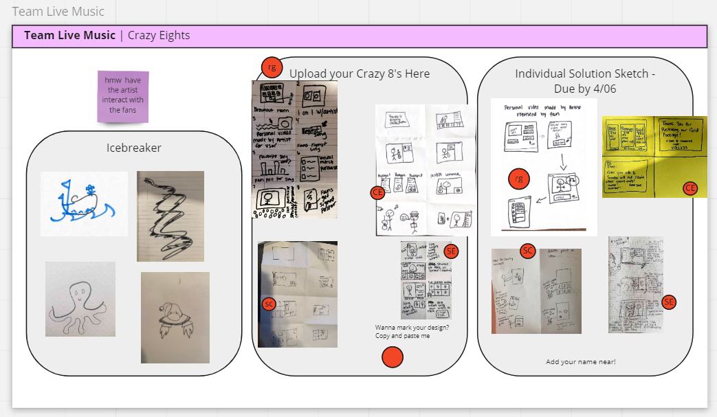
On "Tuesday," we began sketching solutions. We did a four step sketch process where we took notes, doodled rough sketches, did a "Crazy 8s" exercise, then created a solution sketch that included more details. The main part of this exercise was the "Crazy 8s" and the solution sketch. The Crazy 8s process was where we rapidly sketched variations of solutions to recreating the artist/fan interaction. This exercise helped us to produce as many alternative solutions as possible in a short amount of time. Once we finished our Crazy 8s, each team member chose one solution out of their eight to create a detailed soluton sketch. We each uploaded our work onto our Miro board.
|
For my Crazy 8s activity, i made the following iterations:
|
Deciding
|
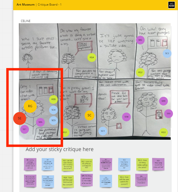
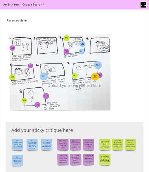
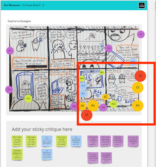
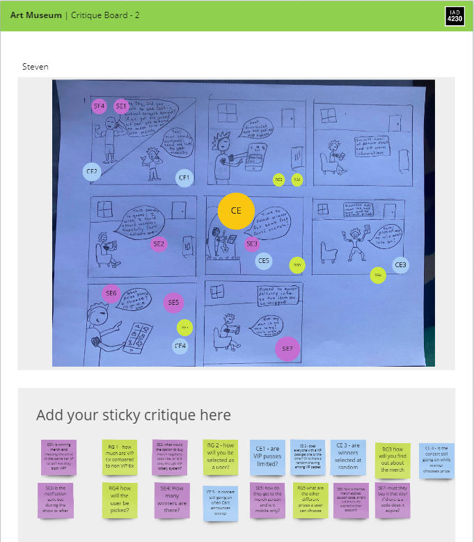
On "Wednesday," we took the ideas from Tuesday's solution sketches, and created a detailed storyboard. Our storyboards were meant to be more detailed and include more focus on the user interface. The objective of our storyboards was to determine which solutions we will prototype according to our long-term goal of recreating the artist/fan interaction. Each team member completed a storyboard and uploaded it to our Miro board. To determine which solutions we would prototype, we did an art museum critique.
|
For my storyboard, I chose a path that allowed the user to choose a ticket package that varied on what benefits they would receive. For example, the basic package included the ticket and the option to use the chat box option throughout the concert. The next package included those benefits along with a phone call with the artist. The last package include the previously mentioned benefits, but instead of a phone call, they would get a video call with the artist.
|
|
View Art Museum PDF here:
|
|
|
|
Once our art museum critique was complete, we drafted a justification of our final decision. We each drafted a 1-2 sentence summary justification. Then our team leader, Stephanie Epeagba, combined them all into a complete statement. Our justification explained how and why we concluded that our final product should highlight the importance of the artist/fan interaction. This has been our main concern to recreate because during user interviews, users emphasized how they missed being able to interact with their favorite artist. The path we decided to focus on aligns with our users’ end goal. So we were confident that our chosen path would be a viable solution to this problem.
|
View Full Justification here:
|
Prototyping
|
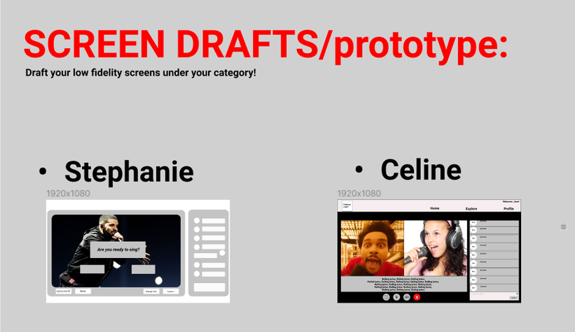
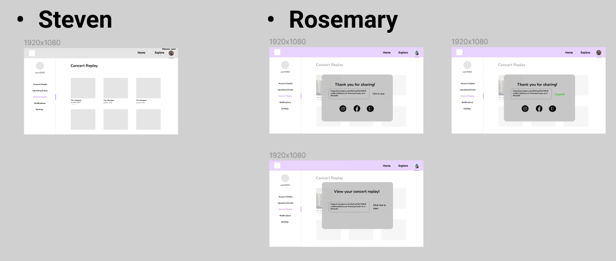
Now that we have established what user path we want to focus on, we began prototyping. We chose Figma as our prototype platform and decided that we would make our prototype a website as opposed to a mobile app. We each divided up what screens we would work on. Stephanie and I worked on the sing-along/concert screens, while Rosemary and Steven worked on the profile page screens. We each created our own variations of the screens, then combined them respectively.
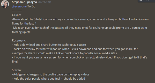
Once we all submitted our low fidelity prototypes, we went over them as a team and made notes of what areas needed work and what details we needed to add before creating our high-fidelity prototype that would be used in our usability tests. |
For my low-fidelity prototype, I wanted to make it straight forward and easy to follow for users. I followed the conventions of having the concert screen on the left of the page and the chat functions to the right.
Since the sing-along feature is a key component of our target, including lyrics to the song was another aspect to keep in mind. I felt like having the lyrics at the bottom of the screen would be best since this is where closed caption is usually located. Therefore, users would expect to see text at the bottom. I continued to follow conventions by creating the navigation bar at the top right of the page, and having the video call functions (settings, mute, camera options, end button) underneath the screen - similar to how FaceTime works. |
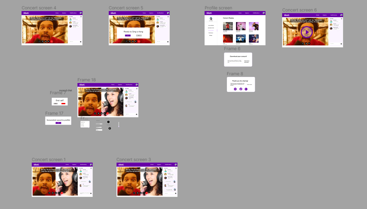
Low-fidelity prototype:
Fixes for low-fidelty:
User Testing
|
Once we completed our high-fidelity prototype, we were ready to test! Our team leader, Stephanie Epeagba, created a usability test plan where we would ask our users to complete a set of tasks while following the Think Aloud Protocol. The Think Aloud Protocol is where we have our users go through our prototype and openly express their thought process. This helps us get inside the mind of our users and allows us to reflect on our design decisions. An important lesson I learned from Jake Knapp's Sprint book was that in this stage of our Sprint, the important thing is to get authentic reactions other than just feedback from our users. Reactions show users' initial feelings towards our prototype and allows us to learn what we did well and what needs improvement.
We decided to conduct our usability tests with the same people we recruited for our user tests. Since they were apart of our user tests, they already had background information about our prototype. We scheduled interviews accordingly and proceeded with our tests. I played the role of both moderator and facilitator. For each interview, I took notes of what I believed were key takeaways. |
|
Takeaways
|
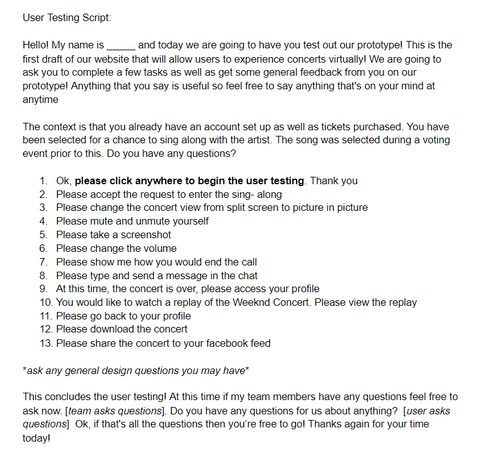
The following graph shows the amount of users that successfully completed our tasks. Green represents if they completed the task successfully, and red means they did not.
|
|
|
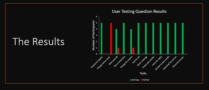
We noticed patterns among all of our usability tests and were able to establish general feedback. Based on information we gathered from interviews, the order of the buttons on the screen could be changed to:
(L to R) 1.Volume 2.Mute 3.Screenshot 4.Settings 5.End Call |
|
|
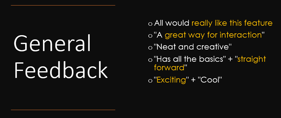
Overall, our users had a good expeience with our prototype. We were able to learn a lot from both their reactions and feedback. Although refinements were not apart of our Sprint process, we were able to take note of what areas we would need to fix if we did have more time in our semester to make these fixes. We successfully addressed a key pain point in recreating a live concert virtually.
|
Conclusion
|
This was my first Sprint and I learned a lot of from this type of design process. It made me focus on the important parts of prototyping. My professor for this course, Morgan Ott, did a great job of breaking down the Sprint to last the whole semester. I think this was a great way to grasp the steps of the sprint for first timers like myself. I feel like I am definitely better prepared for the job market and am more confident in doing a Sprint the way it is usually executed through the five day process.
An important lesson I learned from this Sprint is that when prototyping, there are some areas that do not need as much attention as others, especially when the area is something users are used to, such as a login page for example. Therefore, these areas are not a primary concern. I realized this lesson when looking back on past prototyping projects. I acknowledged areas of those projects where I spent too much time on something that was not apart of user goals. This really improved my mindset moving forward with prototyping. I learned it is important to not focus on the areas I, as a designer, want to work on, but rather focus on designing according to user goals. |
Attributes to Freepik
|
I could not have chosen a better team for my first Sprint. I'm grateful to have had team members I was so in sync with. We had a great team leader and I feel like this leadership really shaped our success. I could only hope to continue to be apart of such great design teams in the future. This Sprint process was a great learning opportunity for me and I definitely feel like my skills and my confidence in my career field grew because of it.
|
Check out our presentations below!
Research Report Out
|
Final Report Out Presentation: |
Attributes to Freepik
|
Attributes to Freepik
|